Create Stronger Landscape Photos With A Tighter Zoom
If you enjoy posts like this, please support my work and support independent photography tutorials like this.
Landscape photographers love wide angle lenses - I’m no exception! Yet there are many strong photos to be found at longer focal lengths. Telephoto and long zoom lenses are not just for wildlife photographers. In this article and accompanying video, I show two examples of where tighter compositions produce a much stronger image.
Use Your Telephoto Lens
Bring your long lens on your landscape outings. Yes, it’s heavier and usually takes up more space in your camera bag (all you micro-4/3rds photographers are smiling right now!). Take in the landscape broadly with your wide angle lens. Also, scan the distance with your long lens. You’ll be surprised how many intriguing compositions are off in the distance that you can bring to life.
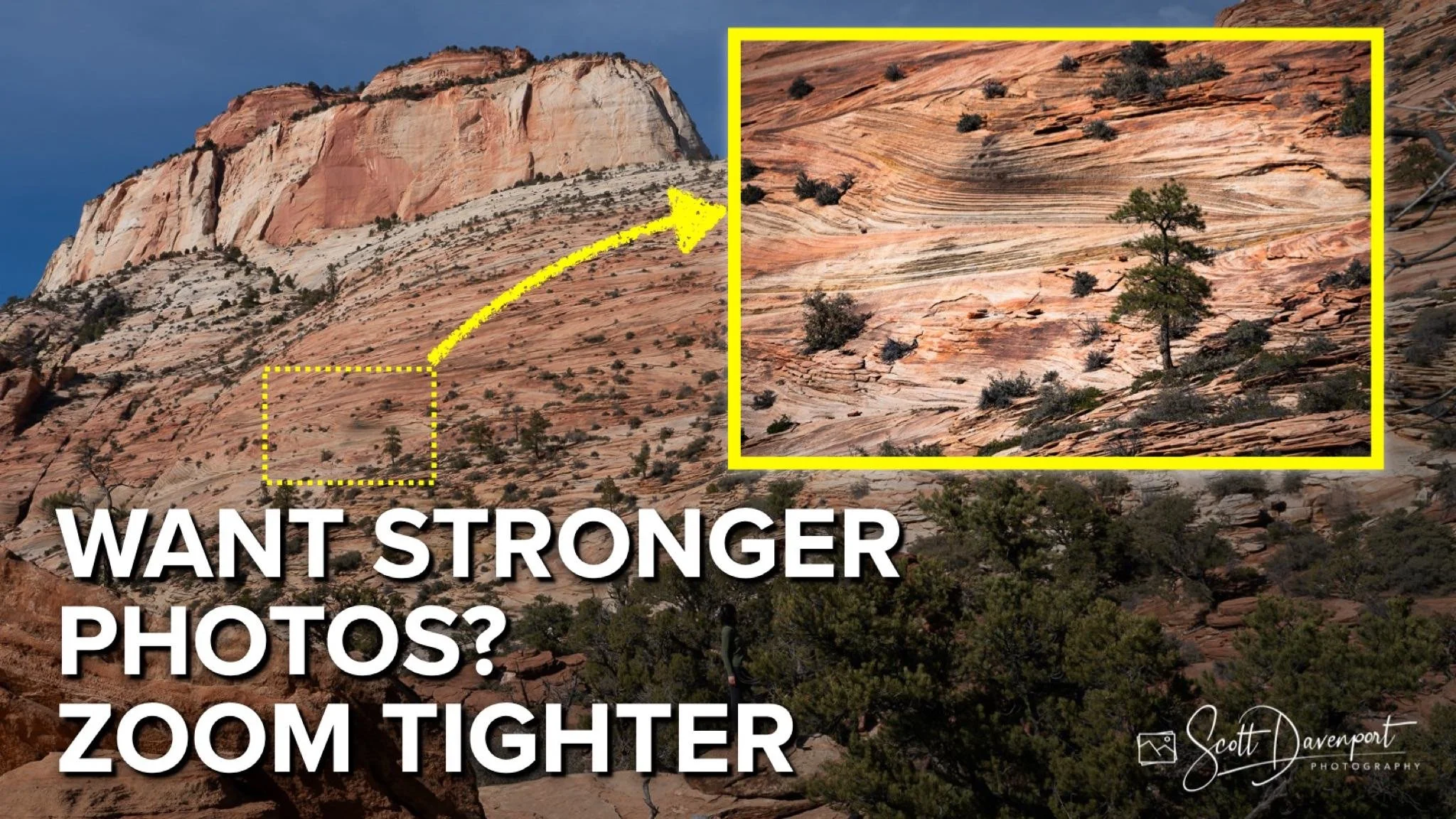
On the Canyon Overlook Trail hike in Zion National Park, I am glad I brought my 100-400 mm lens with me. When I reached the top, of course the canyon was beautiful. And there was more to be had in the cliffs and hills surrounding the overlook.
The broad view at Canyon Overlook in Zion, facing away from the canyon (24 mm)
A longer lens uncovers a wonderful composition hiding in the distant hills (361 mm).
Tree, Zion National Park
Contact Scott to commission a print or license this image.
Crop For A More Intimate Composition
The best camera and lens is the one you have with you. If you don’t have your longer lens, don’t be shy about cropping your photos to get in tighter and tell a stronger story. At the Carmel Mission in Carmel, California there was a group of painters diligently sketching features of the mission in preparation for their work. I only brought my walk-around lens, my 24-105 mm zoom lens.
An artist at the end of a pathway, their coat draped over a chair that looked like a cape, was a great photo opportunity. I reached in as far as possible with the lens I had. In post, I realized it wasn’t a tight enough framing. The story was the artist and their subject. Cropping was the answer.
The original framing of an artist sketching an architectural feature at the Carmel Mission. The photo has merits, yet the story is the artist and not the pathway or foliage.
Cropping the image more tightly makes the artist the clear subject. I kept some of the foliage as natural framing.
TITLE
Contact Scott to commission a print or license this image.
