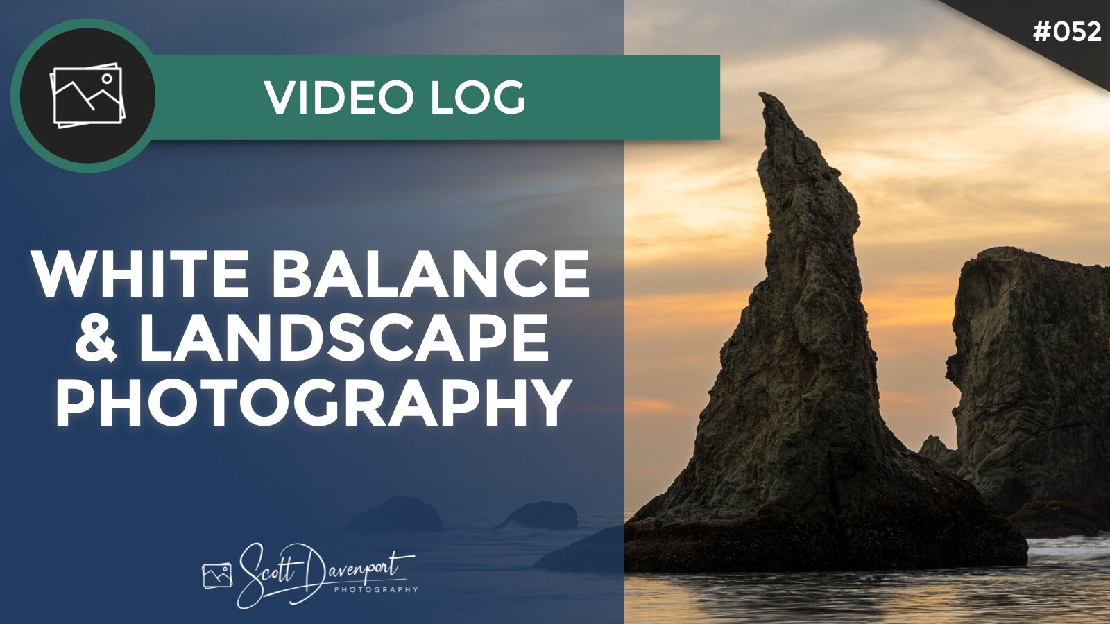
White Balance As A Creative Choice For Landscape Photography?
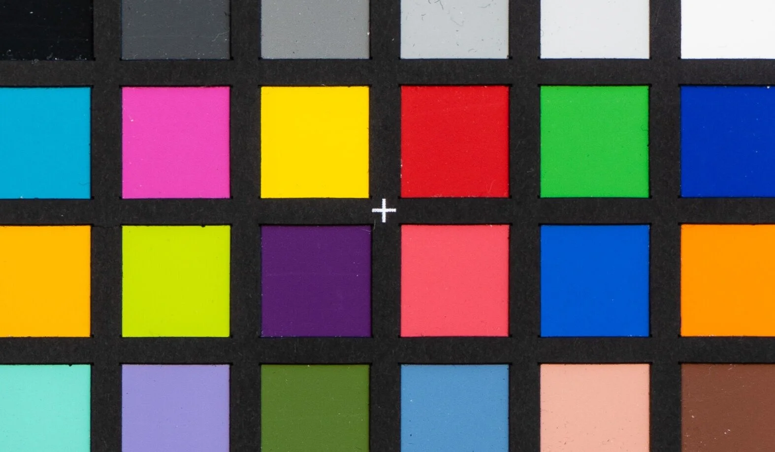
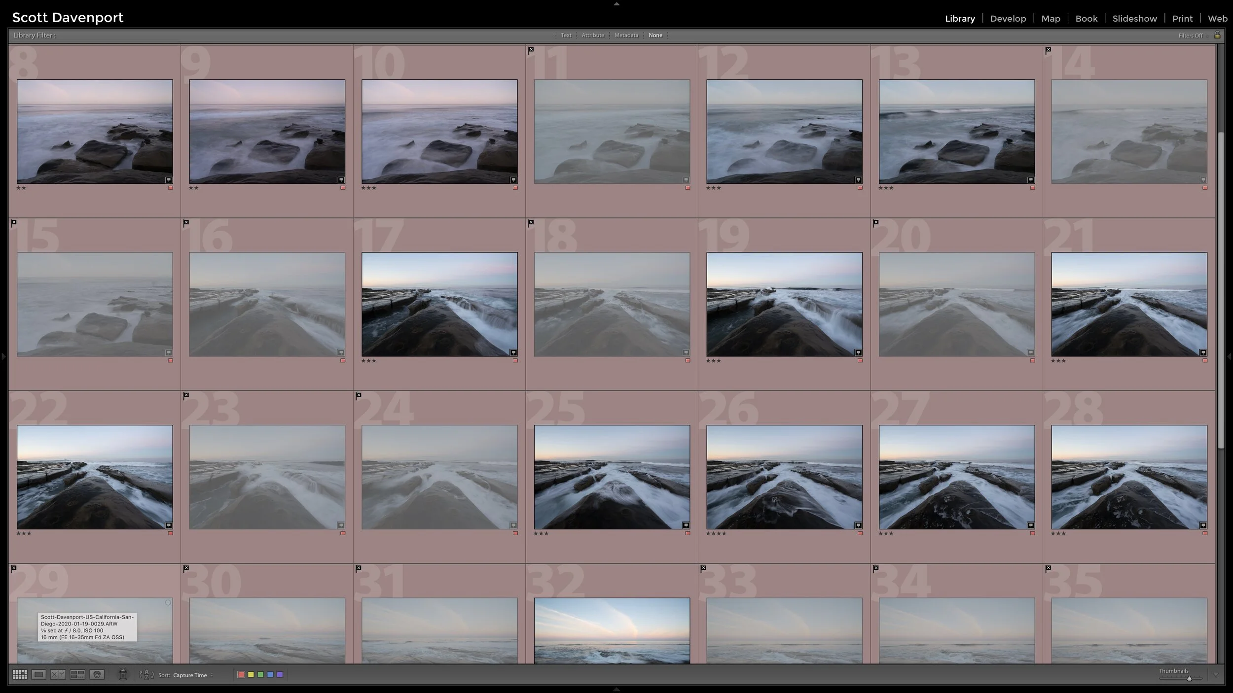
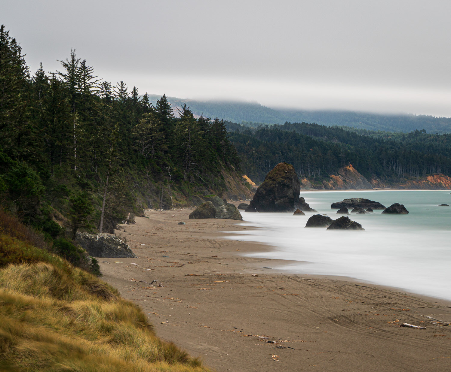
In my opinion, white balance is a creative choice for landscape photography. When processing a photo of Bandon, Oregon I realized how much I’ll push white balance sometimes to get a certain mood or look for a photo.
What are your thoughts? Do you push white balance around to achieve a look? Or do you prefer to keep white balance within “normal” ranges or use color cards to keep tones in check?
Subscribe and share!
Video Logs
A Creative Exercise To Improve Your Eye For Composition