Did I Go Too Far With This Photo?
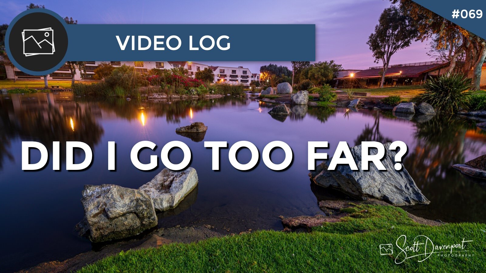
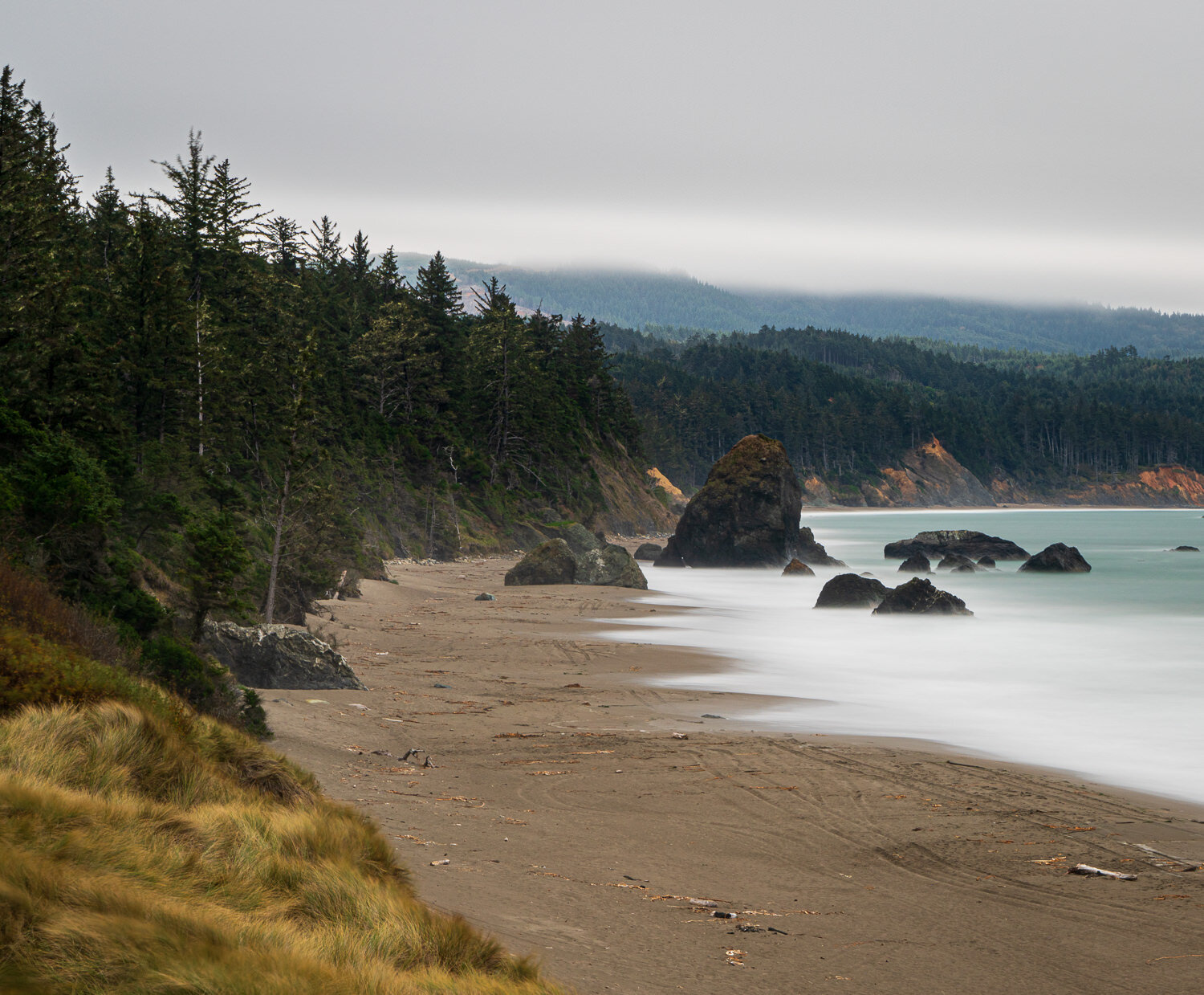
I set out to create a twilight feel for this scene, yet after the processing was done, I felt like I went too far. The colors were a bit over the top. I backed things off a touch, as you’ll see in the video.
So what do you think. Did I go too far with this photo?
Subscribe and share!
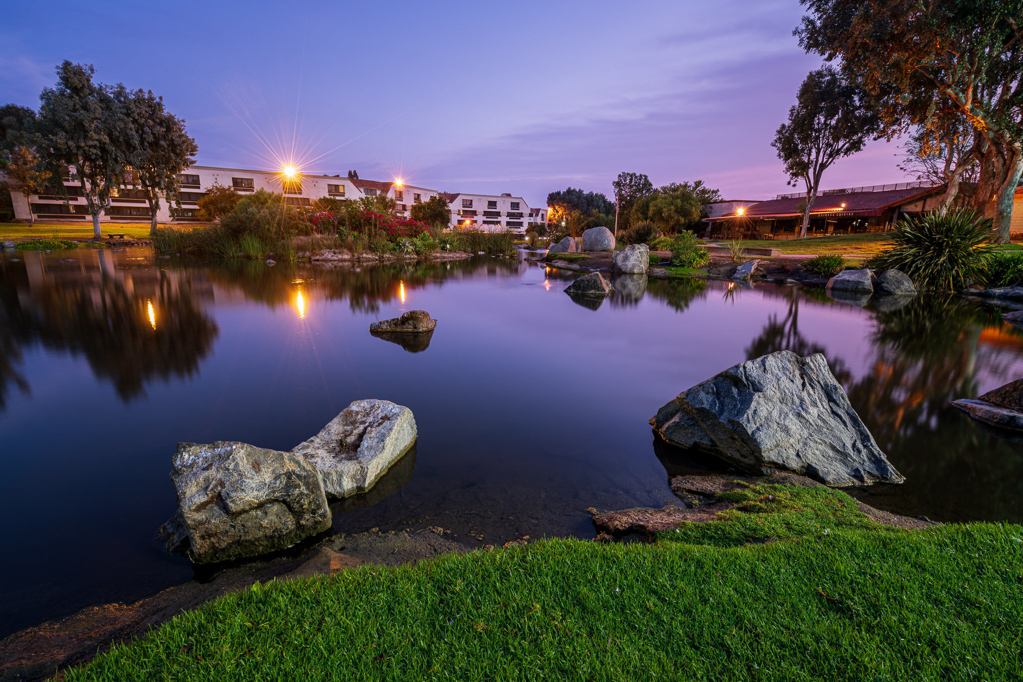
1 | First Pass
Colors are overly vibrant, a bit surreal.
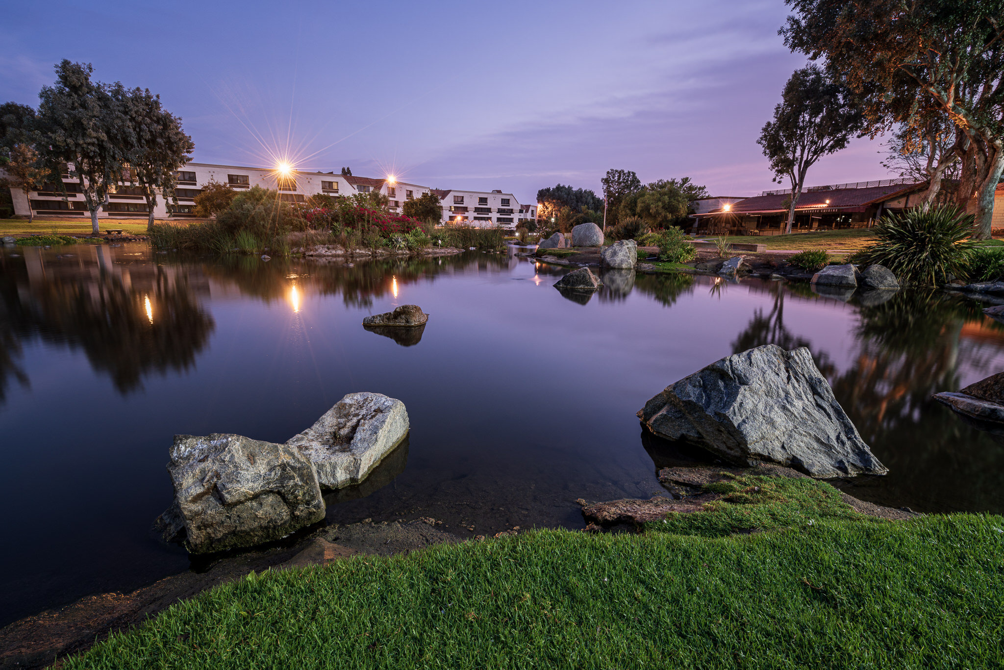
2 | Global Desaturation
Colors too dull now.
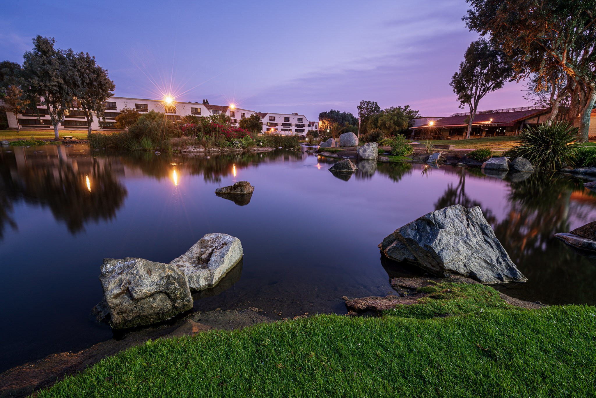
3 | Selective Desaturation
Toned down different color channels at different rates.
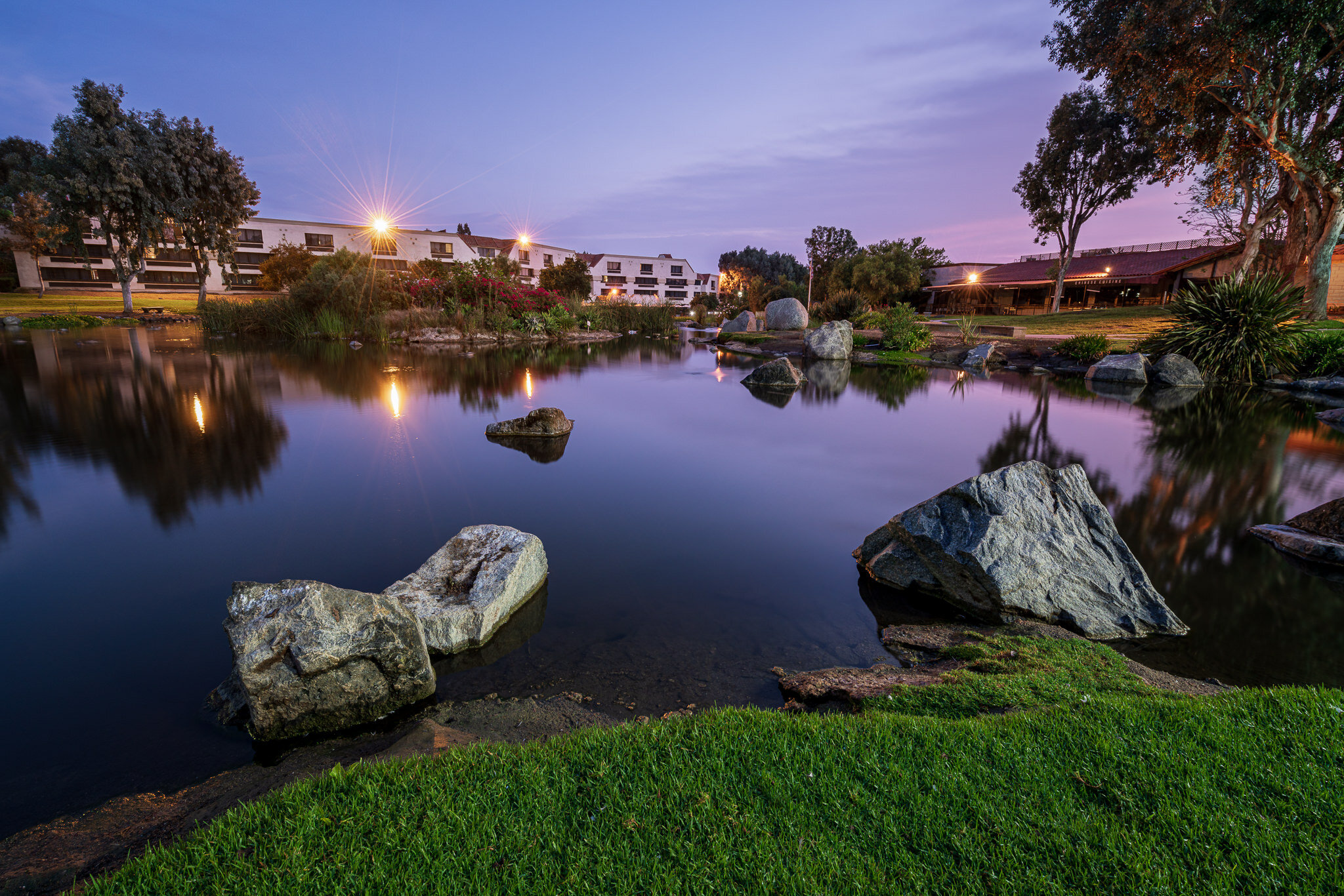
4 | Tint Reduction
A final nudge to the tint, reducing the purple hue.
Video Log
A Creative Exercise To Improve Your Eye For Composition

