Tinting Black & White Photos In Lightroom - In Post #522
Back in the dark room days, different chemical processes could produce a slight (or maybe extreme!) color tint to your black and white photos. The same effect happens when making physical prints, because different papers have different color casts. Some papers run warm, others run cool, and that changes the overall dynamic of the photo.
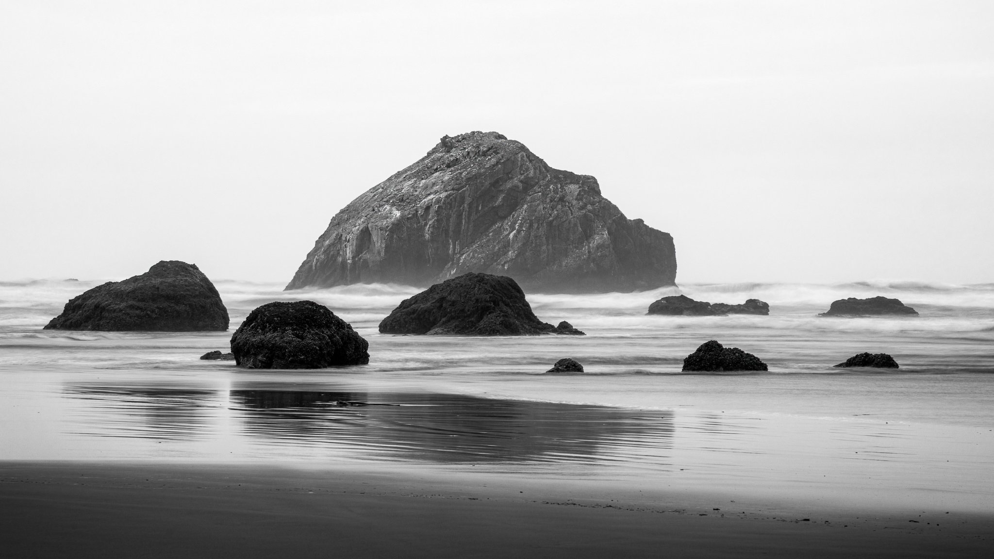
These types of tinting can also be done with your pure digital black & white photos. In my work, I sometimes like a subtle purple tint to the shadows. In this article, I share two different techniques for tinting black and white images in Lightroom.
Color Grading
The Color Grading tool in Lightroom is one method to tint your images. This tool lets you add a color tint to the shadows, midtones, and highlights. A color is selected using the color wheel or the Hue, Saturation, and Luminance sliders. Also, each tonal range can be tinted with a unique color. The Balance and Blending sliders are used to control how your chosen colors mix among one another. I have separate tutorials that go deeper into Lightroom’s Color Grading tool and also the difference between the Balance and Blending sliders.
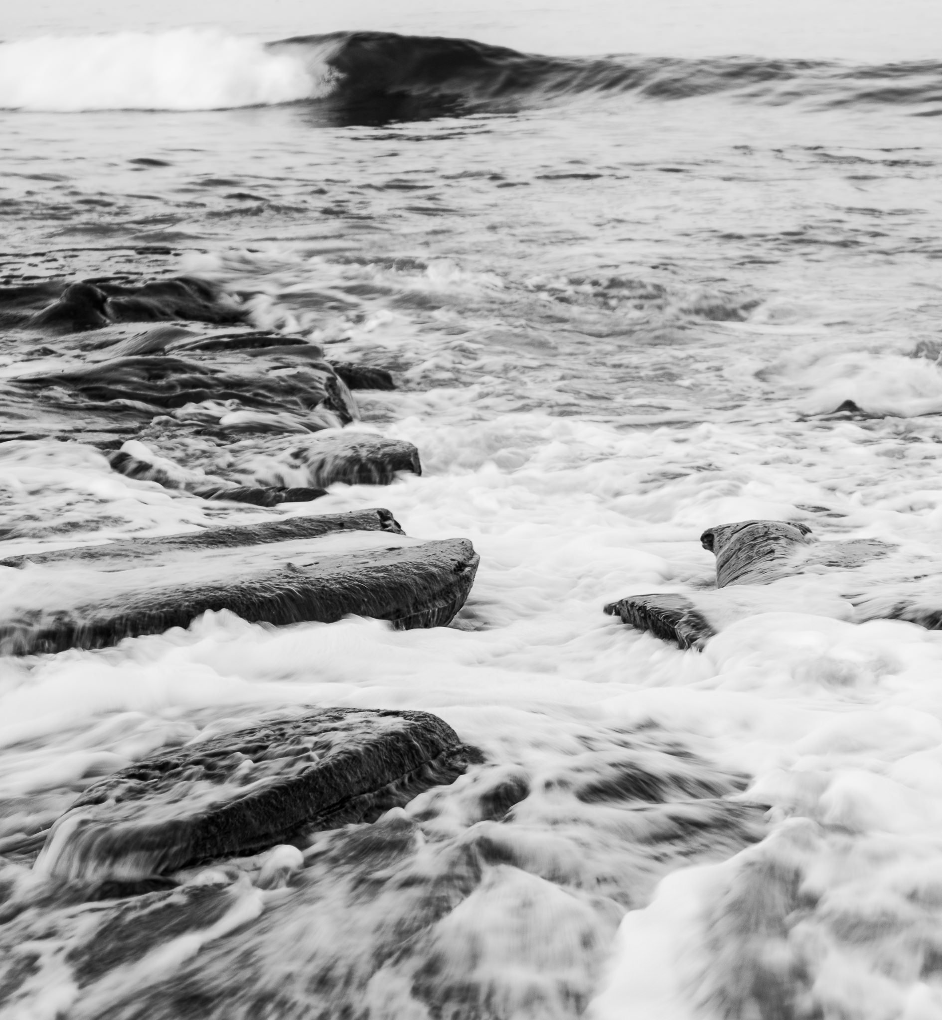
For my photography, I like to tint the shadows with a soft purple tone. It is a subtle touch yet noticeable when you apply it. In the screenshot below, I’ve chosen a moderately deep purple. The Blending and Balance sliders are both pushed pretty far to the right. The higher blending smooths out the tint across tonal areas and the Balance slider tells the Color Grading tool to treat less of the tones as shadows (a softer, more subtle tint).
Tinting shadows in Lightroom with the Color Grading tool.
Luminosity Masks
The second technique to tint your photos in Lightroom is to use a luminosity mask with a color tint. A luminosity mask is a special type of mask that is created using the tonal values of your image. Newer versions of Lightroom have excellent masking controls and make working with luminosity masks straightforward. I have another article that explains the Lightroom masking tools in more detail.
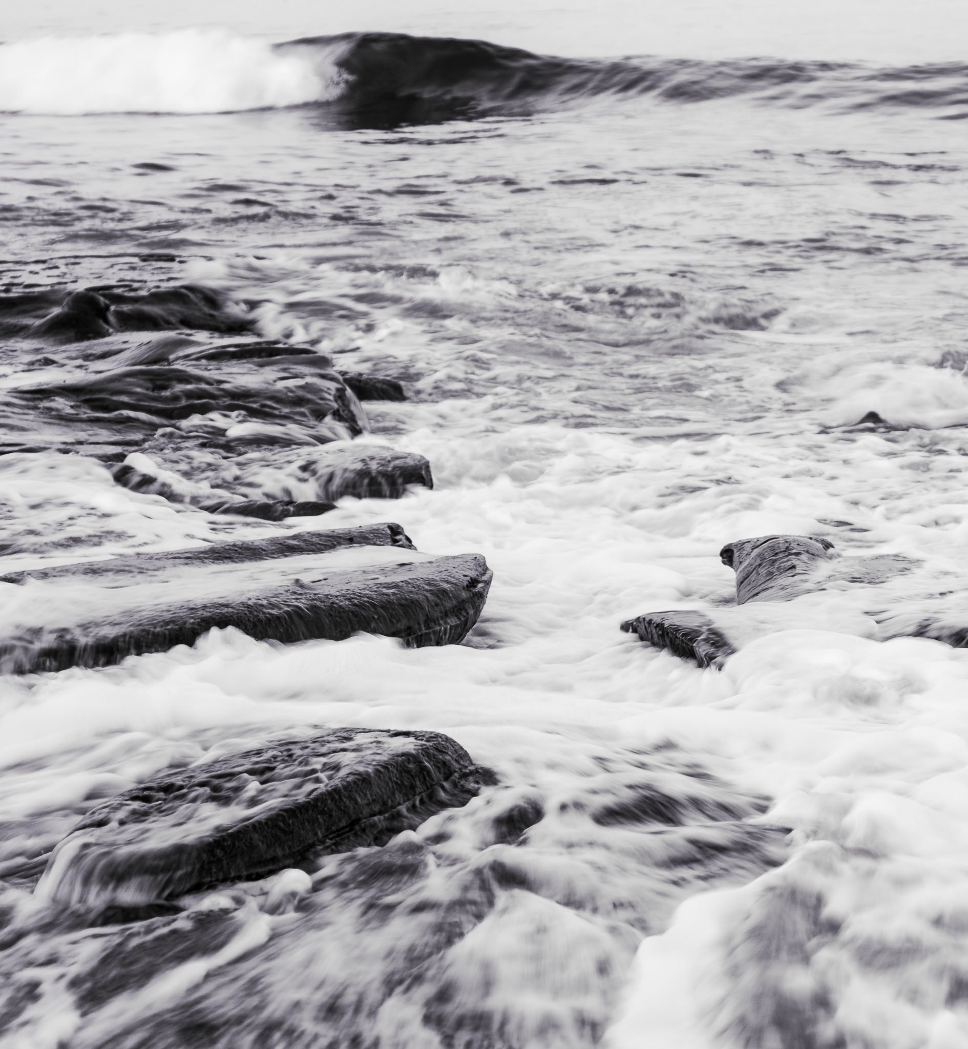
To tint the shadows with a purple hue, I’ve applied a luminosity mask as shown below. First, notice the Luminance Range settings beneath the histogram. The most affected range is in the shadows. The range tapers off to 0 to protect the deepest shadows and keep them mostly black. Also, the range extends well into the upper midtones. For this image, the more gradual fade simply looked better and did not create artifacts or an obvious “cut off” between tinted and non-tinted areas.
Where does the actual tint happen? That’s the Color setting in the lower part of the masking controls. Clicking that color swatch brings up a color selector tool. It works a little differently than the Color Grading tool, but has the same fundamental options of hue and saturation.
You’ll also notice the purple I chose for the luminance range mask is lighter than the Color Grading tool. The reason for that is purely aesthetics. I liked the way this lighter purple looked with the mask. A darker purple was too strong of a look.
Tinting shadows in Lightroom with luminosity masks
Conclusion
Either of these tinting methods is fine. One is not better than the other. In my case, I preferred the extra control I got with the luminance range mask and being able to protect the very deep shadows. Also, these are different tools and will produce different results. As you saw above, I used similar but not identical colors with each tool. Ultimately, it is up to you. Use the tools and colors that best suit your taste and artistic vision.