Create Powerful Black & Whites In Luminar AI
If you are trying Luminar AI or upgrading from a prior version, please consider using my affiliate link. There is no extra cost to you and it helps support Luminar AI tutorials like this one. Ready to buy? Use the offer code SDP10 at checkout and Save US$10!
Black & white photos tell a story differently than their color counterparts. Deep contrast and good separation of elements help create rich, compelling black & white images. The Black & White Tool in Luminar AI makes it easy to convert an image to monochrome. Yet that is only the beginning. You need to dig into the sliders to craft a stronger photo. The Black & White tool has controls over six different color ranges so you can expertly brighten and darken different tones, creating a stronger photograph.
I approach my black & white work in three main steps: convert the image, understand the tones, and shape the luminance.
Step 1 - Convert The Image
You may be tempted to jump directly to the Black & White tool. Before you do, apply Enhance AI to address the fundamental tone and contrast in the scene. Then do the conversion. Converting an image to black & white in Luminar AI itself is easy. Open the Black & White tool in the Essentials group and click the Convert to B&W button.
The color is slurped out of the photo… and it probably looks a little flat.
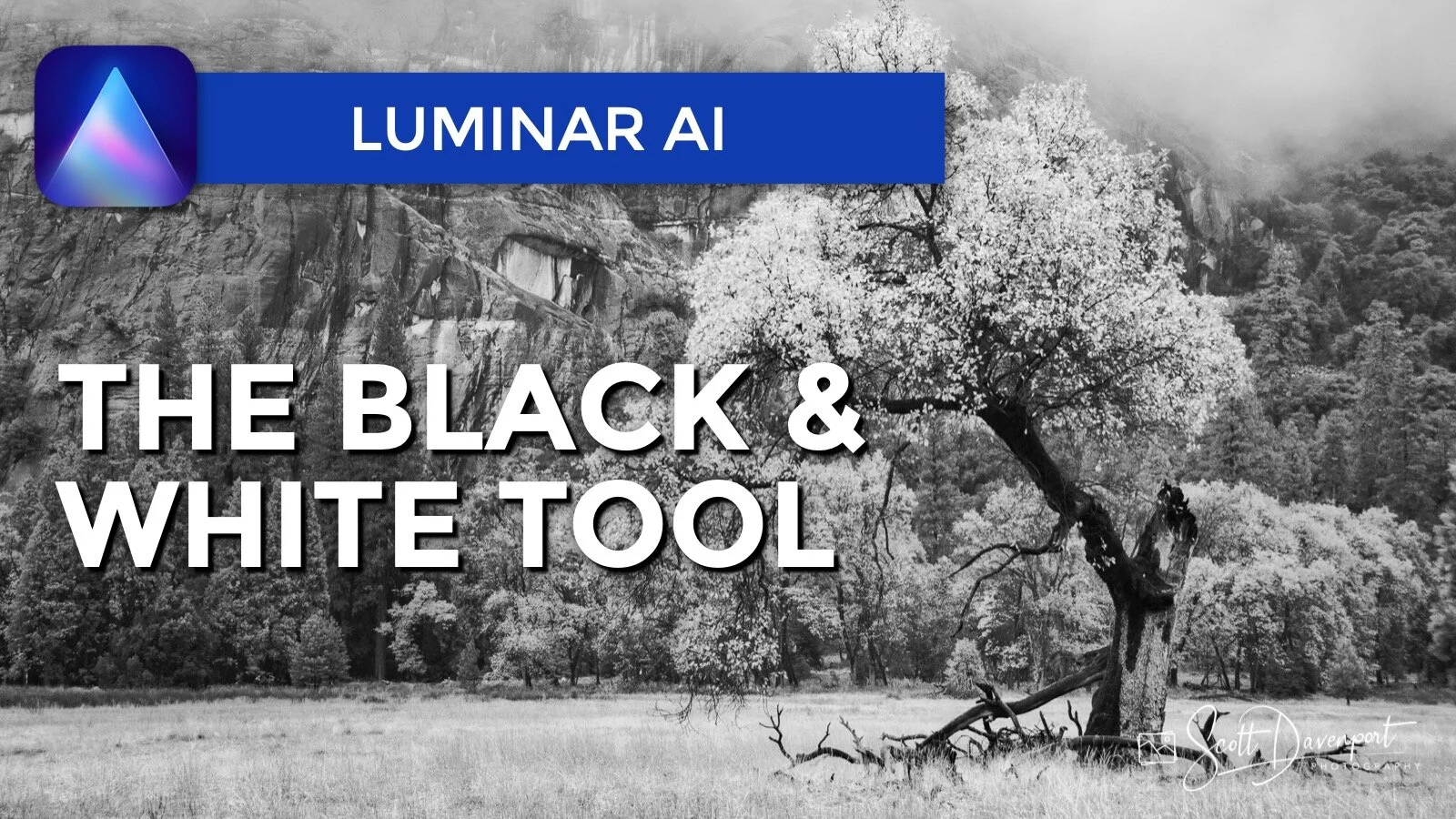
Convert to Black & White in Luminar AI
Step 2 - Understand The Tones With The Saturation Slider
Next, switch to the Saturation tab in the Black & White tool. Wait… Saturation!?!?! Aren’t I making a black & white image? Yes, however, the Saturation controls help you visually identify what areas of your photo will be affected by each color range.
The saturation values are all zero after converting to black & white. That makes sense - all the color has been removed from the photo. Visit each color range and increase its saturation. Pay attention to what areas, subjects, and elements in your photo are affected. Make mental notes about whether you want to lighten or darken those elements.
The Red and Yellow color ranges affect the foreground tree and grasses.
The Green color range affects the tree line in the mid ground.
The Blue color range affects the rocks in the background.
In this image of a tree in Yosemite, the warmer color ranges affect the foreground and subject. The tones of the cooler ranges are much more prominent in the background.


Step 3 - Shape The Luminance And Create Contrast
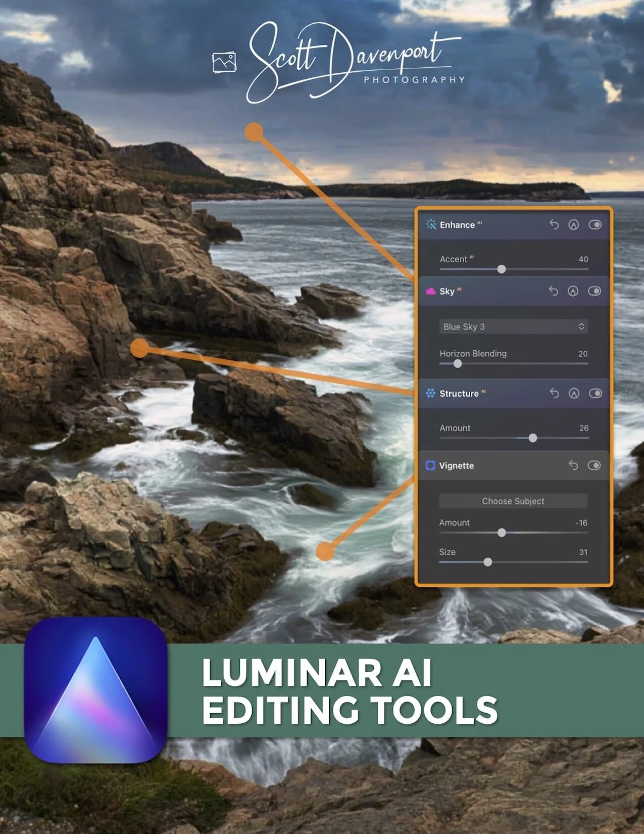
Now that you have an understanding of the tones in your image, switch back to the Luminance tab and adjust the sliders with more confidence. Drag sliders to the left to darken color ranges or to the right to brighten them. Play brighter tones against darker tones to increase depth in your photo and accentuate your subject. In this scene, I decreased the luminance of the cooler tones, pushing the background farther into the scene. Conversely, I brightened the red and yellow color ranges to make my subject - the tree - stand out more and approach my viewer’s eye.
Adjust the Luminance sliders using the knowledge gained when exploring the tones. Accentuate your subject and add depth.
After the luminance tones are adjusted and shaped, you can fine tune other adjustments like Smart Contrast in the Light Tool or add detail with Structure AI. Finishing off with a light Vignette is almost always a nice touch, too.
Tree, Yosemite
Contact Scott to commission a print or license this image.